Conversion Rate Optimization
How to Create High-Converting Landing Page: CRO Growth Tactics

Abhishek 💫
Updated on: May 16, 2025
Designing a high converting landing page is an art - a blend of strategic design frameworks and growth experiments.
In this blog, I’ll show you how to create a high converting landing page step by step. I’ve broken down this blog into five parts:
Crafting a basic layout for your landing page
Writing high-converting copy
Best practices for landing page design
Growth tactics to improve form submission rates
Creating a landing page experimentation framework (template included)
By following these steps, you’ll master the process of building landing pages that drive high conversion rates. Let’s dive in

1. Define Your Key KPI
Start by defining the purpose of your landing page. Clearly state your page's goal and focus on a single call-to-action (CTA). Avoid multiple CTAs, as they can confuse users and reduce conversions.
For example, if your landing page asks users to both "Sign Up for a Webinar" and "Download a Guide," they may hesitate or feel overwhelmed about which action to take. This hesitation often leads to no action at all. Focus on a single, clear CTA to guide users effectively.
Examples of clear CTAs:
Book a consultation
Register for a webinar
Sign up for an event
Request a demo
Once your goal is clear, you can move to the next step: outlining your landing page.
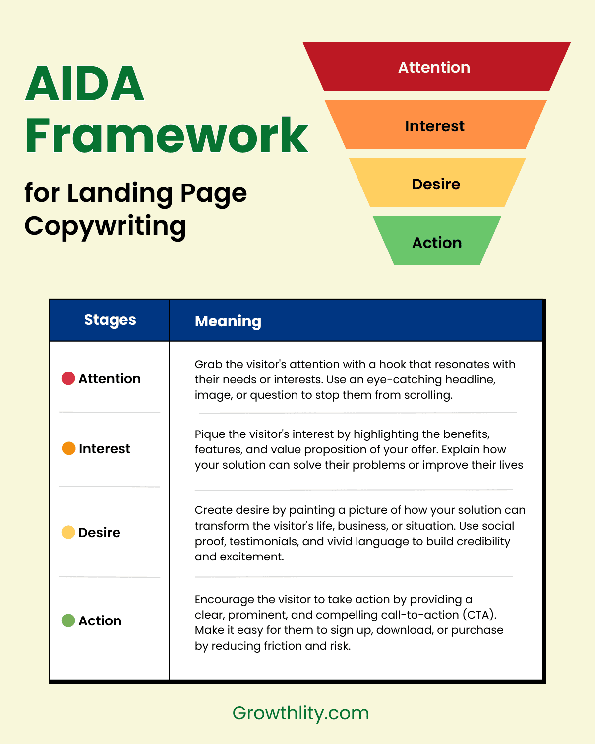
2: Create landing page Copy with AIDA Framework
Before writing detailed content, create a rough outline. Focus on the main heading and subheading, following the AIDA framework.
The AIDA framework is a simple yet powerful tool for writing effective copy. It helps you structure your overall landing page copy, it stands for:
Attention: Grab user interest immediately. For example, use a headline like "Double Your Sales in 30 Days" or pair it with a visually striking image, such as a graph showing exponential growth. These elements immediately engage users and set the tone for your page.
Interest: Showcase value and relevance.
Desire: Highlight benefits and appeal.
Action: Guide users toward your CTA.
3: Language and tone of the landing page copy
So, when writing copy, it's really important to use language that connects with your audience.
First, try to talk directly to your reader using words like "you" and "your". This makes it feel more personal.
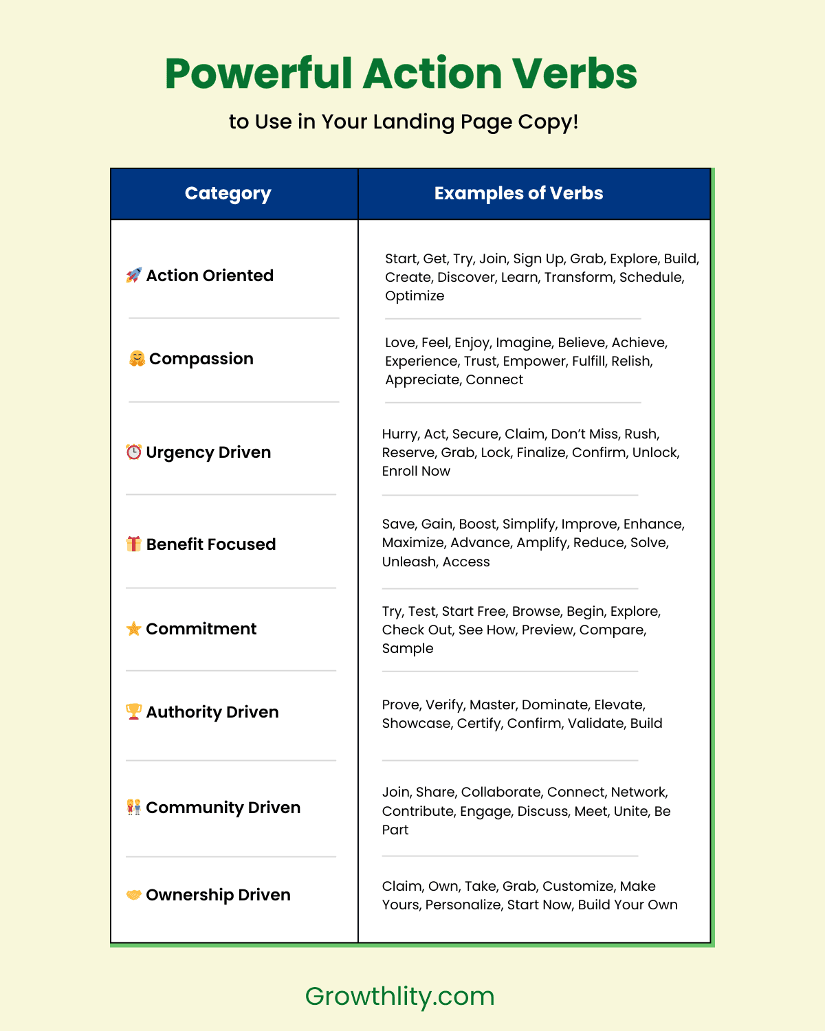
Make sure you are using Power verbs. These are actionable verbs that evoke emotions, create a sense of urgency, and inspire action. They are used to add depth, clarity, and persuasive power to copy writing, but at the same time dont over use it, beacuse we dont want to sound too salesly and desperate.
Write in a conversational tone that resonates with your audience. Once your content is ready then its time to start working on the design.
4: Designing a High-Converting Landing Page
4.1: Crate an Attention-Grabbing Hero Section
Your hero section is critical - it’s where most drop-offs happen. Ensure your headline is concise, impactful, and resonates with users. For instance, a headline like "Transform Your Business in Just 7 Days" paired with a powerful subheading can instantly connect with user aspirations and spark interest. Follow it with a strong CTA.
4.2: Align Headlines with Ad Copy
If you're driving traffic to your landing page from Meta Ads or Google Ads, make sure the headline in your hero section resonates with your ad copy. If the ad copy doesn't match the first heading and subheading, users will likely bounce. So, make sure to A/B test headlines to find the most compelling and relevant messaging.
4.3: Always Place Your Form or CTA in the First Fold
Especially when driving traffic from paid ads, I've found that most users fill out the form without scrolling more than 40% of the landing page. Often, just the headline and a bit of information are enough to convert. That's why it's recommended to always place your CTA button or form in the first fold, right after your first heading and subheading.
4.4: Ensure Your Landing Page is Mobile Responsive
In today's digital landscape, it's crucial that your landing page is mobile responsive. If you're driving traffic from Meta Ads, it's essential to ensure your website loads properly on mobile devices. Test it thoroughly before launching your ad campaign.
Especially when running social media ads, make sure your website loads quickly. Social media users have short attention spans, and if your website doesn't load fast, they're likely to bounce.
4.5: Optimize Your Landing Page Load Time
No one likes a slow website. Ensure your landing page loads in milliseconds. To achieve this, use a reliable server, Content Delivery Network (CDN), and optimize images on your landing page.
For expert assistance, reach out to your web developer and ask them to perform necessary speed optimizations. Once your landing page is ready, test its load time.
Tools like Google PageSpeed Insights can help you test and optimize. If you plan to run ads in the US, check how quickly your website loads there. You can also test load time based on country to ensure optimal performance.
4.6: Choose User-Friendly Fonts
When designing a landing page, it's easy to overlook the font. However, this small detail can make a significant difference. Ensure the font you select is legible and easy to read. While a cursive or stylized font might be readable to you, it may not be as clear for a 40-50 year old user.
Fonts also have a psychological impact. Choose fonts that are clean, clear, and professional. Some excellent options include:
Arial
Verdana
Helvetica - Source Sans Pro
4.7: CTA placement
Spread your CTAs throughout the page but don’t overdo it. Each CTA should guide users to the form or desired action.
4.8: Remove Navigation Bars from Your Landing Page
This growth tactic can significantly improve your landing page conversion rates. When a user visits your landing page, our primary objective is to present them with relevant information while minimizing distractions.
If a user sees a top navigation bar, they might click on the hamburger menu and navigate away from the page, potentially harming your conversion rates.
However, if you intentionally want users to explore your site, that's a different strategy. But if you offer multiple products or services, it's often better to restrict users to that specific page to encourage conversion.
Through extensive testing, I've consistently found that landing pages without navigation bars tend to convert the best.
4.9: Boost Conversions with a Sticky Bar
Adding a sticky bar to your landing page with a powerful call-to-action (CTA) is a highly effective growth tactic to increase form fill rates. Ideally, place the sticky bar at the bottom of the landing page. You can experiment with different types of sticky bars, such as those with countdown timers or placed at the top of the page.
I've found that the most effective sticky bar configuration is one placed at the bottom of the page, which include a CTA button, a compelling actionable headline, and a timer.
4.10: Offer Incentives to Drive Immediate Action
Drive immediate action by offering limited-time incentives, such as discounts, bonuses, or exclusive deals. Utilize countdown timers or place offers directly below the form to encourage swift submissions.
Example: "Limited Time Offer: 60% Off for the First 500 Signups"
4.11: Leverage Testimonials and Social Proof
People relate to people, and they're drawn to stories and real-life experiences. Showcase user reviews, trust badges, or client logos to build confidence and credibility.
So now lets take a look at a actual landing page and try to analyse it.
5: High Converting Landing Page Breakdown
When creating a landing page, it's crucial to research your competitors and analyze their strategies. Study their Unique Selling Proposition (USP), design elements, and overall approach. This will help you craft a landing page that outshines theirs.
Let's take a real example. I've chosen the Glucose Goddess Recipe Club landing page, founded by Jessie Inchauspé, a renowned French biochemist and New York Times bestselling author. I've been following her content on YouTube, and now let's break down the design elements of her Recipe Club landing page.

Now that you've learned how to design an effective landing page, it's time for the most exciting part!
I will share some growth tactics that have helped me create multiple high-converting landing pages. By applying these strategies, you'll be well on your way to building a lead generation machine that drives results!
6: Growth Tactics to improve your form submission rate
Form submissions are a critical metric for any high-converting landing page. To optimize this, you need a combination of smart design choices and strategic tactics that lower friction for users while driving action. In this section, we’ll explore practical methods to enhance your form submission rates and boost overall conversions.
6.1: Minimize form Fields
When driving cold traffic to your landing page, users are unlikely to be familiar with your brand, making them hesitant to share extensive personal details. Starting with just a name and email address can help build trust and increase conversions.
So, keep your form concise by only asking for essential information. If you need to collect additional data, test different form versions to determine which one performs best.
6.2: Leverage IP Detectors
You can capture valuable user information without explicitly asking for it in your form. Basic demographic details like country and region can be automatically tracked using tools like Customer Data Platforms (CDPs) or CRMs. This approach enables you to gather essential data points without adding unnecessary form fields, creating a seamless user experience.
6.3: Prefill the Form using URL parameters to prepopulate fields
Marketers often use this clever growth tactic to streamline the user experience. If you already have user information, you can pass it through URL parameters to auto-fill form fields. This saves users time and significantly improves form fill rates.
For example, let's say you're inviting your email subscribers to a workshop. You can include their email address in the link, so when they click on it, the form on the landing page is already filled out with their email address and name. This saves them time and makes it more likely that they'll complete the form.
Marketers use this technique in their email and SMS campaigns. If you use a CRM or email marketing tool, it's easy to set up.
6.4: Avoid embedded iframe forms
Many a times, instead of creating a native form, marketers end up embedding 3rd party forms in the landing page. This becomes a big mistake if you are running ads. If you are using a 3rd party form, you have to embed it in your landing page and it loads as an iframe.
The problem with iframes is that they load very slow, and when a user lands on your landing page, they usually skim through the content. By the time they scroll through the page, they will miss out on the form because it wouldn't have loaded by that time.
I caught this issue when I was running a campaign where I was driving traffic from Meta Ads to a landing page to make people book a consultation.
What I did was I directly embedded the Calendly booking link in the landing page. After testing it for a few days, I realized that by the time a user scrolled through the page, the form was not loaded completely.
The same thing happened even with a HubSpot form I embedded in the landing page. Since then, I always ensure that I make forms native and don't use any embedded forms.
6.5: Create Urgency
When a user is on the verge of filling out a form, it's essential to motivate them to take action. At this point, they're likely weighing whether to proceed, so adding a small line of text below the form can significantly boost conversion rates.
Try using phrases like "Hurry, seats are filling fast!" or "1000+ people have already registered." This creates a sense of urgency and authority, reassuring users that the action they're taking is safe and popular.
Now that you've created your landing page, what's next? It's time to set up a sales funnel.
7. Support Your Landing Page with a Sales Funnel
Your landing page should be part of a larger sales funnel. A well-designed sales funnel can help maximize your Return on Ad Spend (ROAS). Here are some examples of how landing page sales funnels can be applied to different use cases:
Workshop Registration Campaign: After a user fills out the form, send a thank-you email with a referral link, encouraging them to invite others.
Paid Appointment Consultation: Set up an abandoned cart follow-up sequence for users who fill out the form but don't complete payment.
Re-Engage Potential Leads: A sales funnel helps you re-engage with potential leads, increasing the chances of conversion.
By implementing a sales funnel, you can nurture leads, reduce drop-offs, and ultimately drive more conversions.
Now that your landing page content is ready and designed, it's time to launch, monitor, and experiment. Don't wait – push your landing page live and start your campaign. This marks the beginning of the experimentation stage.
In this stage, your primary focus is to:
Monitor performance
Test new elements
Tweak and refine
Repeat until you achieve desired results
Let's dive into the process of experimenting with your landing page to boost conversion rates.
8: How to do landing page testing & Experimentation?
Once your landing page starts receiving traffic, it's essential to begin experimentation to optimize its performance. To do this effectively, ensure your analytics is properly set up to track users visiting your landing page.
Here are some free tools I recommend:
Analytics: Google Analytics (free), Mixpanel, Posthog
Heatmap: Microsoft Clarity (free), Hotjar
8.1: Start with a Hypothesis Testing Framework
Begin by brainstorming and documenting all the potential tests you'd like to conduct on your landing page to boost conversion rates. Be creative and consider all aspects, such as:
If i will use video testimonial instead of image, then it will improve my form submission rate
If i will limit 70% discount to only first 100 user then more people are going to signup
Using headline A instead of headline B to drive instant sign-ups
Using Orange color in the CTA will drive more CTR
Now that we have a list of hypotheses, it's essential to prioritize them to identify the experiments with the maximum potential impact.
To achieve this, we can use the RICE prioritization framework, a widely used methodology among product managers.
Let's explore how to apply the RICE framework.
8.2: RICE Scoring Formula for Landing Page Experiments (Template)
The RICE scoring formula helps prioritize experiments based on their potential impact. RICE stands for Reach, Impact, Confidence, and Effort.

✅ Access the Google sheet template here: Get the template
Here's a breakdown of each component:
Reach: Estimate the number of people who will see your landing page. Enter the daily page views (e.g., 1,000).
Impact: Assess the potential impact on your primary KPI (form submission). Score from 1-5, where 1 is minimal impact and 5 is maximum impact.
Confidence: Rate your confidence in the hypothesis, where 1 is low confidence and 5 is high confidence.
Effort: Evaluate the time required to implement the change. Score from 1-5, where 1 is very time-consuming and 5 is quick to execute.
The RICE Score Formula:
Calculate the RICE score using the following formula:
(R x I x C) / E = RICE Score
This formula helps you prioritize experiments based on their potential impact, reach, and feasibility. Once you've listed all your hypotheses, calculate the RICE score and sort them to prioritize tasks accordingly.
You can also keep a track of your landing page conversion rate using a website conversion rate calculator.
8.3: Monitor landing page visitors using Heatmap Testing Tools
After launching your landing page, wait a day and then analyze how users interact with it. Utilize free heatmap testing tools like Microsoft Clarity to visualize user behavior.
Heatmap testing tools provide valuable insights into:
How users interact with your landing page
Where they click the most
Areas that receive the most attention
Analyze user behavior, identify patterns, and make data-driven changes to optimize your landing page's performance.
How I Leveraged Heatmaps to Optimize the FAQ Section?
During a landing page optimization experiment, I discovered that many users were engaging with the FAQ section, which was initially placed at the bottom of the page. This insight was invaluable.
Upon closer analysis, I noticed that certain questions received more clicks than others. To capitalize on this, I rearranged the FAQ section to feature the most popular questions at the top.
I also refined the landing page copy in other sections to align with the answers users were seeking. Although this tweak may seem minor, it's precisely these small optimizations that can collectively drive significant conversion rate improvements.
The key takeaway? Continuously experiment, analyze, and refine your landing page to unlock its full potential.
9: Test, Tweak, Analyze and Repeat
Landing pages with good conversion rates aren’t built in a day. They’re the result of:
Continuous testing and learning.
Regular tweaks based on data and user behavior.
Patience and consistency in applying insights over time.
You now have the ultimate guide to creating a high-converting landing page! It's time to put these strategies into action and launch your own landing page.
Need feedback or optimization suggestions? Feel free to reach out, and I'll be happy to provide a FREE audit of your landing page!
10: Commonly Asked Questions
How to be a good CRO?
Conversion Rate Optimization (CRO) is about data-driven experimentation. Use heatmaps, A/B testing, and customer insights to make incremental improvements.
What are the key elements of a high-converting landing page?
A compelling headline, engaging visuals, persuasive copy, a single CTA, a well-placed form, trust signals, and a fast-loading, mobile-friendly design.
How many CTAs should a landing page have?
Ideally, just one primary CTA to avoid confusing users. However, you can repeat the CTA multiple times in different sections.
What is the best way to A/B test a landing page?
Test one element at a time – headlines, CTA buttons, colors, form length – using a structured hypothesis-driven approach. Use tools like Google Optimize or Optimizely.
How do I reduce bounce rates on my landing page?
Ensure fast loading speeds, make your headline match user intent, remove unnecessary navigation, and use engaging visuals and clear CTAs.
How important is page speed for landing page conversions?
Crucial! A slow-loading page increases bounce rates and kills conversions. Optimize images, use a CDN, and leverage browser caching.
What are the best tools for optimizing landing page conversion rates?
Google Optimize, Hotjar (for heatmaps), Unbounce, Optimizely, and Crazy Egg are great for CRO testing and insights.